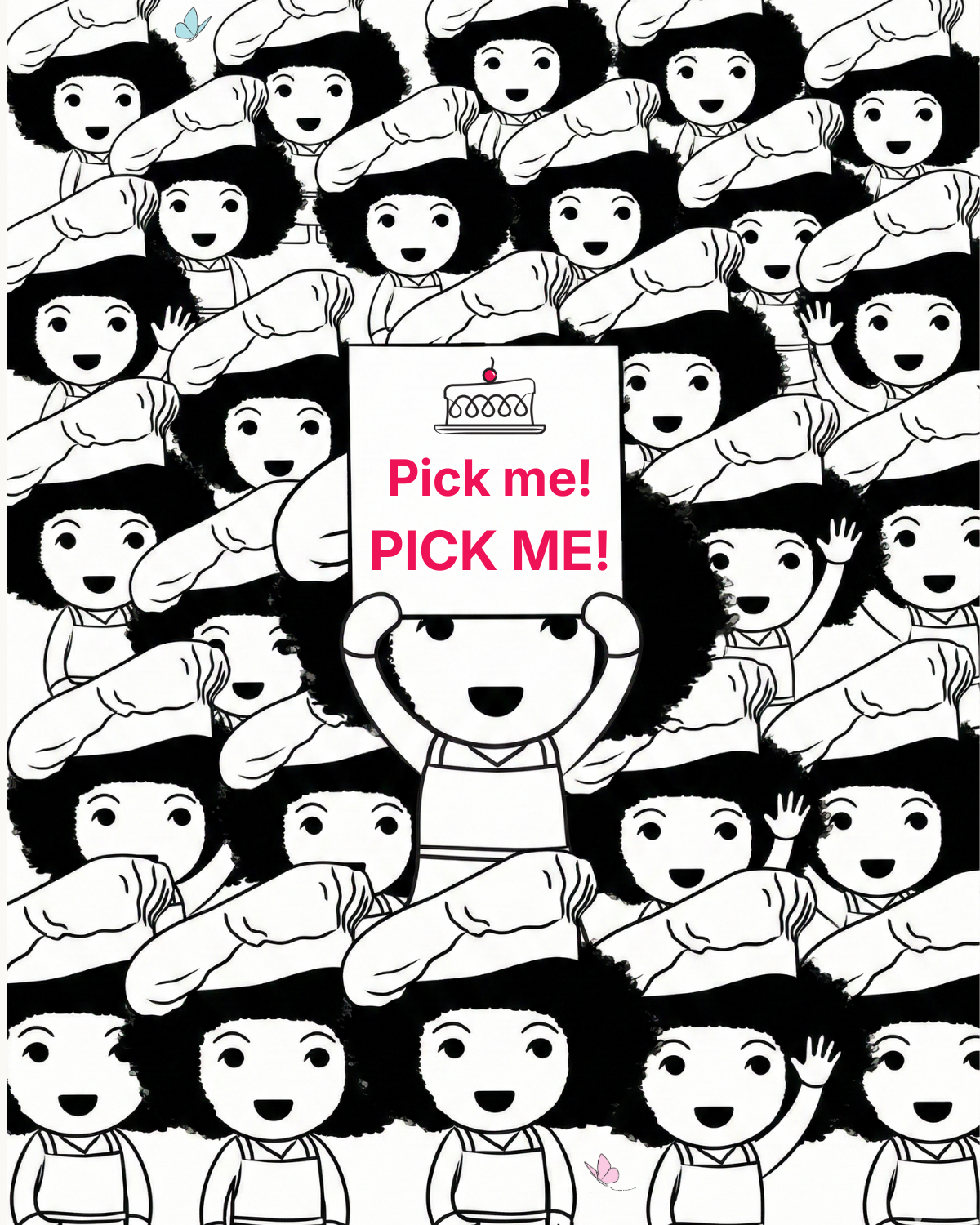
🍰 Cake's Take on uncomfortable but necessary questions. This week: where does your sample actually come from?
If you've ever commissioned online research, like a nationally representative study or a survey of 300 grocery shoppers, you'll probably feel it’s a solid base for decision-making. But have you ever asked where those people came from? How were they recruited? What checks were done to make sure they're real people?
The research industry is talking about data quality a lot, but these conversations aren't always being had by those who are commissioning research and basing real decisions on the results. I understand why though, because it feels like the provider's responsibility.
But last year the Market Research Society (MRS) estimated that data quality issues cost the industry £209 million annually. The indirect cost of business decisions based on unreliable data is harder to size.
Part of it is a structural problem. Some online panels operate through router systems, where people who don't qualify for one survey get automatically redirected to another. When they reach your survey, they may have answered loads of screening questions yet be given a very low 'reward' for their time.
There's also fraud, with survey completion by ‘bots’ (automated fake respondents) becoming a growing problem. Some bots can imitate human response patterns and get past basic attention checks.
In reality, how much difference does this make?
In my experience, it can be huge and costly. A client once asked me for help with a dataset that included all sorts of contradictory answers. After a lot of digging I could separate the questionable stuff from the real story (but it took time!).
In a more rigorous test, it was found to be the difference between having to remove 6% vs. 32% of the data on a study. This was a study among 18-30 year olds by a UK panel provider who decided to put their approaches to the test. Something I always like to see!
Whatever your research budget, the decisions you're making off the back of data are only as good as the data itself.
Here are some questions I think are worth asking when you’re talking to insight partners about your next brief:
- Where is the sample coming from? Is it a managed panel, an aggregator (a platform that pulls respondents from multiple sources), or river sampling (where people are recruited from ads/pop-ups)?
- How are they rewarded?
- What quality checks happen? During and after fieldwork.
- What % of data typically gets removed during cleaning?
If you have a study coming up and you want to feel confident that the data will be worth acting on, I’d be happy to have a quick chat to talk through what to look for, please use the link in the comments.
#CakesTake #CakeConsulting #MarketResearch #DataQuality #QuestionEverything
Sources: MRS.org.uk, Operations Network, David Sutterby; Yonder Data Solutions, "Not all panels are created equal".
🍰 Cake's Take on the 450-year-old default nobody thought to question
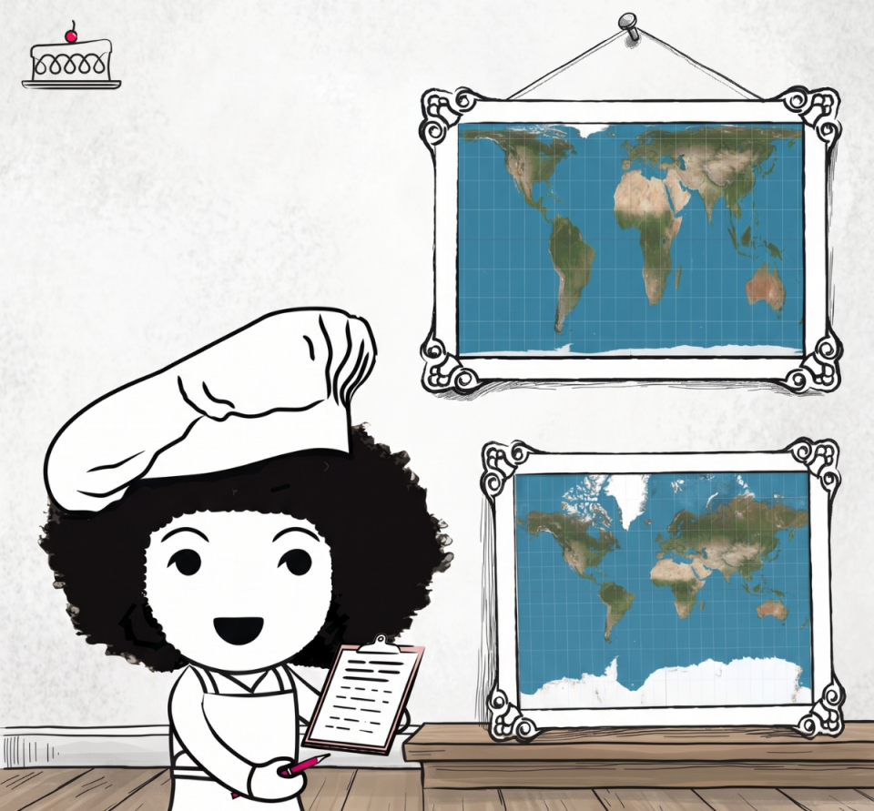
I was watching an episode of The West Wing (with the Big Block of Cheese Day, if you know, you know) and I was stunned to find out that the world map I know is wrong.
The “Mercator projection” has been the default world map since 1569, designed for sailors and navigation purposes, and it does that job brilliantly. The problem is that somewhere along the way, it became the default for everything else too, in classrooms, in textbooks, on Google Maps…
While it’s tricky to flatten a sphere onto a 2D surface and make it representative, the map most of us know as the default is HUGELY distorted, for example:
- On the default map, Greenland appears roughly the same size as Africa.
- In reality, Africa is 14 TIMES LARGER than Greenland and you could fit the United States, China, India and most of Europe inside Africa and still have room left over.
As the African Union's Deputy Chairperson put it, when the size of Africa is misrepresented on maps, the world's perception of the continent is also distorted, including in media, education and policy. "It might seem to be just a map, but in reality, it is not".
This is a tool that was designed for one purpose, adopted as the default for everything. In research and insight, we inherit defaults all the time. Research approaches, question wording, visualisation templates, benchmarks, norms, even professional partnerships, all come with assumptions. By using them without ever asking whether they're still fit for purpose, we risk shaping outcomes in ways we don’t even notice.
Is there something that you’re currently doing day in and day out that needs to be seen with fresh eyes? The world map I thought I knew going largely unchallenged for over 450 years has certainly made me think a little differently about things today.
#CakesTake#CakeConsulting#SmallBusiness#QuestionEverything
Sources: Wikipedia/Mercator projection; NPR, August 2025 (African Union Correct The Map campaign); Visual Capitalist (True Size of Africa).
Also, you can back the "Correct The Map" campaign here: https://correctthemap.org/
🍰 Cake’s Take on what to read about AI when you don’t want to read any more about AI!
Probably like many of you, my LinkedIn feed is saturated with AI stuff and I’ve been talking to clients and colleagues who have had enough!
I can’t fully turn it off, but it is easier to scroll passed it all when you already have great information sources on tap.
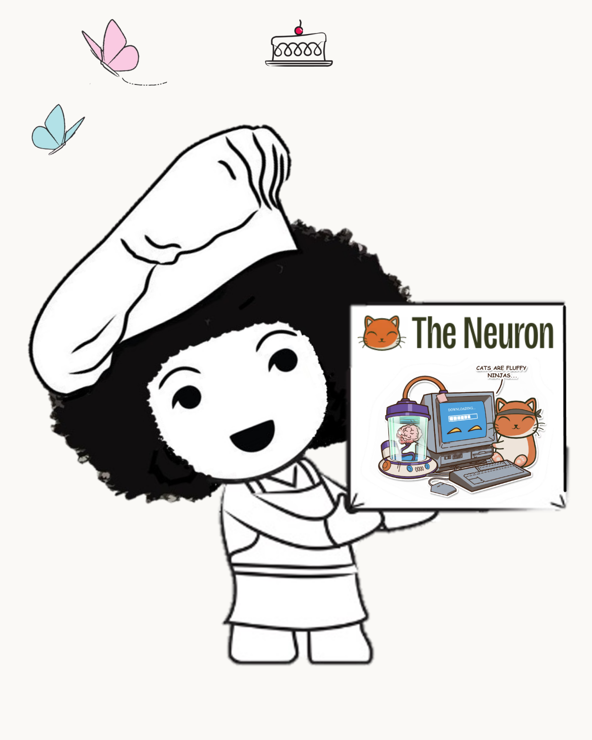
I wanted to share my two fabulous GO-TOs just in case you also want to reduce the noise a bit:
- The Neuron - AI News: I read something from the Neuron every single day. Corey Noles and Grant Harvey beautifully gift-wrap AI headlines and insights in a human way and offer treats to try in every newsletter.
- Ruben Hassid: I actually discovered Ruben through The Neuron but he has his own newsletter and posts regularly on LinkedIn too. He’s been working with AI for years and offers guidance and practical tips that are clear and easy to follow (which is just how we like it at Cake).
If you need to clear your head a little, give them a try for a week and just stop reading everything else. Oh and I'm not being paid for these recommendations!
#AI #CakeConsulting #TheNeuron #RubenHassid
🍰 Cake’s Take on Getting on AI’s good side
There’s a lot of talk about how WE use AI but I’ve also been having conversations with organisations who need help understanding how AI is affecting their ability to reach their target audiences.
Our little AI friends are shaking up decision-making so understanding AI usage and its influence has to now be part of any audience insight.
I’ve read some fascinating articles that underline that as much as we need to keep on top of AI in our own day-to-day, the audiences we are researching are also changing dramatically:
- Over 80% of AI searches are "zero-click”, by which they mean the users get the answer they need from AI and never go on to visit the website. Which means a direct and measurable brand connection is lost.
- Shoppers find AI’s input decisive and say it increases their confidence in their purchase decisions.
- One US report found that in a non-profit context, AI-driven visitors give more on average, although less frequently.
- Princeton University and IIT Delhi researchers found that traditional search rankings are becoming a poor predictor of AI recommendations. Essentially a brand's visibility in AI answers doesn't depend on their Google rank.
- Adding specific statistics and credible citations to your content can increase the likelihood of an AI recommending your brand by up to 40%.
All of this means there are a couple of important things to add to the to-do list:
- Whatever the sector, organisations need to see AI as a meaningful touchpoint in its own right and understand it as such.
- Organisations need to optimise their content in a way that maximises their probability of being found and recommended by AI.
So, do you know how your audience is using AI and how it’s affecting your reach? Is your content up to scratch and are you on AI’s good side?
I’ll leave you with another fact which I hope will encourage those not engaging with AI to get more involved: it took Facebook more than four years to reach 100 million users. It took Instagram two and half years. It took ChatGPT just two months.
Sources: Clickvision / Similarweb Data 2026; Boston Consulting Group and McKinsey; Brand Discovery in the age of AI Report by Blue State; GEO: Generative Engine Optimization (feel free to message me for links).
🍰 Cake’s Take on Chess in Happy Hour
I was in the local pub last night and as we looked about for somewhere to sit, 3 tables in the main bar were reserved; I expected a birthday bash, I found Chess Club.
It was one of the pub’s busiest nights and right in the middle of the action, 3 tables of people playing chess and it felt wonderfully normal.
It made me think about connection and the spaces that are actually available to find it.
I do a lot of work in market sizing and with pubs in decline the topline data would suggest that the ‘chess’ segment is too niche to truly help their bottom line, but we always need to look deeper than the transaction value:
- Recent data shows that for every £1 a pub invests in community focused activities and adaptations, there is a social value return of over £8 (this covers things like improved wellbeing, increased social action, more resilient communities).
- 20%+ of Gen Z don’t drink alcohol. When a more niche activity like chess feels at home on a busy Thursday night, the pub stops being just a place for drinking and starts being that all important ‘third space’ (a space away from home and work) where connection can be found.
- And it’s what people want too, 67% of Brits see pubs as vital for tackling loneliness and social isolation.
Whether it’s insight in hospitality, retail, FMCG, healthcare or charity, we at Cake are mindful of measuring the connection behind the transaction or interaction. A market in decline could also be changing shape in wonderful ways (with a landscape full of new potential!).
So what does your insight look like at the moment… Are you just measuring the transactions and interactions, or are you also measuring the glue that keeps people coming back?
And could you create more ways for people to connect?
(Sources: Pub is The Hub: Social Value Report, Greene King nationwide survey and BBPA Polling.)

🍰 Cake’s Take on Speaking Plainly
Last night, announcements at Euston station warned me to take care while walking around the station because of the recent inclement weather... INCLEMENT weather?!
It got me thinking about the use of plain language (I’m a BIG fan) and while 'inclement' may sound more professional, the data shows us the real value of keeping it simple:
- 80% of people prefer sentences written in plain language and this includes expert users with a high level of specialist knowledge. Also, the more complex the issue, the greater the preference for plain language.
- It can affect business performance in real terms too. Stripping out jargon from product pages led to a 17% increase in completed purchases for one multinational retailer.
The applications are obviously far and wide but in my day to day it’s about making sure that everyone in the room ‘gets it’ without exception. Your insight experience, your closeness to the goals, your level of category knowledge, none of it should matter.
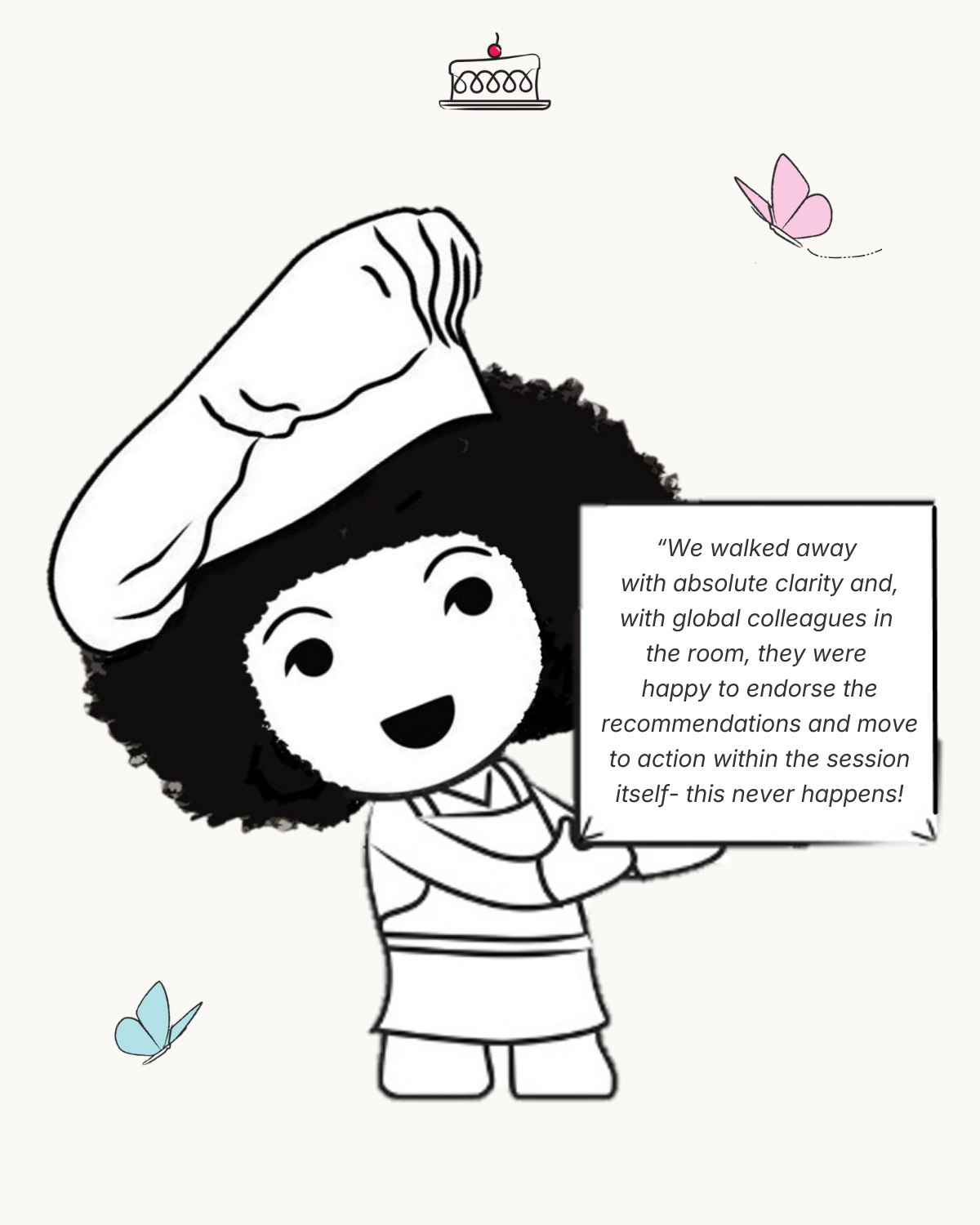
(It works for us at Cake Consulting too, see below for a bit of love we’ve received).
So is your messaging a bit "inclement"? Have a look at your last email, report or proposal and see if you could have made it a little bit simpler.
(*Sources: Christopher Trudeau / Eugene Mischenko)
🍰 HOT off the press!
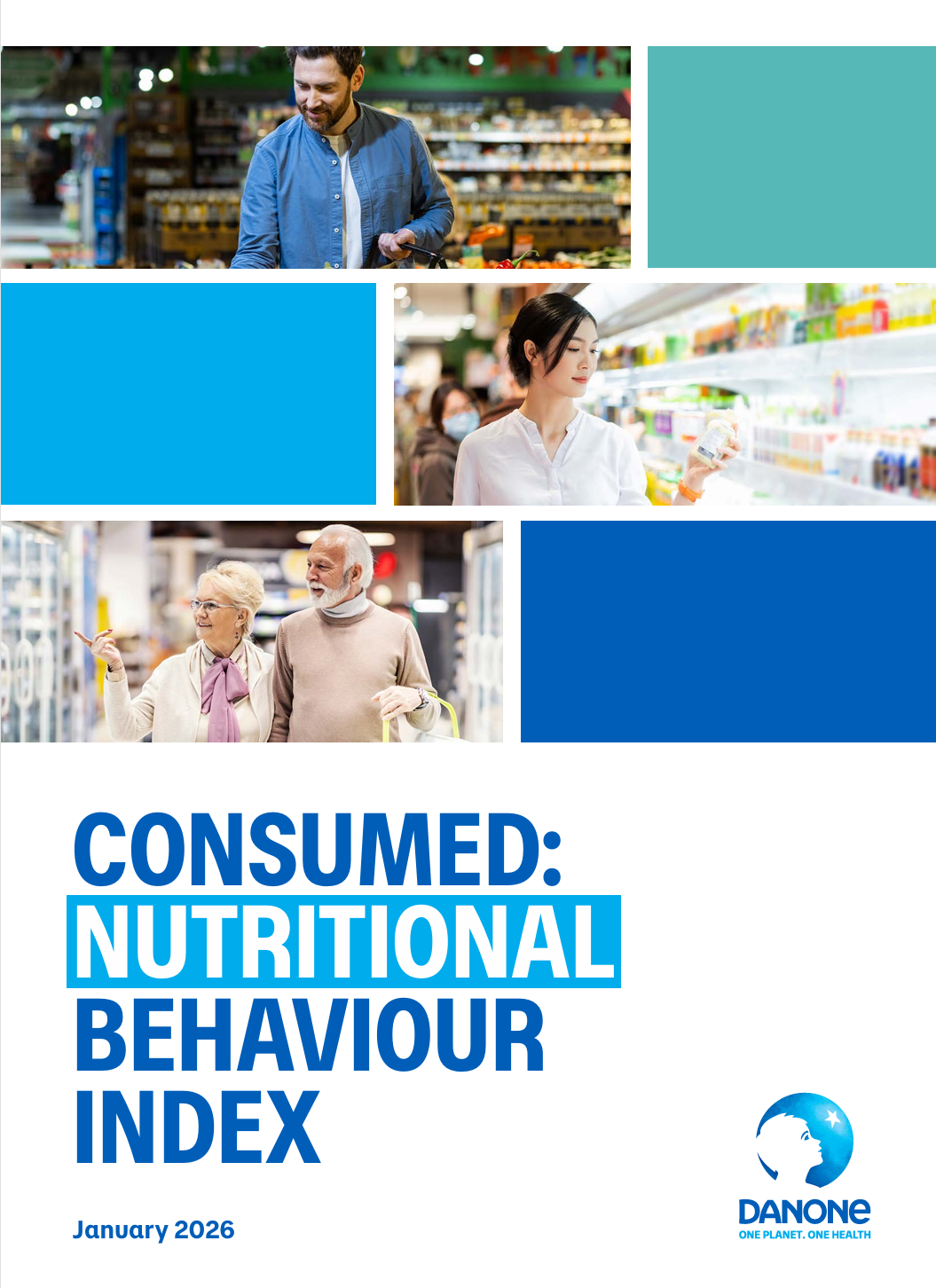
HOT off the press! It makes me so happy to see this report from Danone out in the world.
We at Cake Consulting are proud to have provided some of the essential ingredients for the research behind this report, summarising the perspectives of Dietitians and Nutritionists who see the consumer confusion in their day-to-day work.
Cake’s Take? Here’s to taking some meaningful steps towards creating a clear framework (based on evidence!) that everyone can use to make healthier choices. I hope the report makes waves!
You can read it here: https://lnkd.in/ewKEai4B
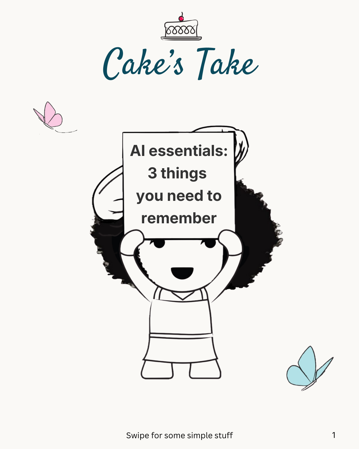
🍰 Cake’s Take on 3 AI Essentials
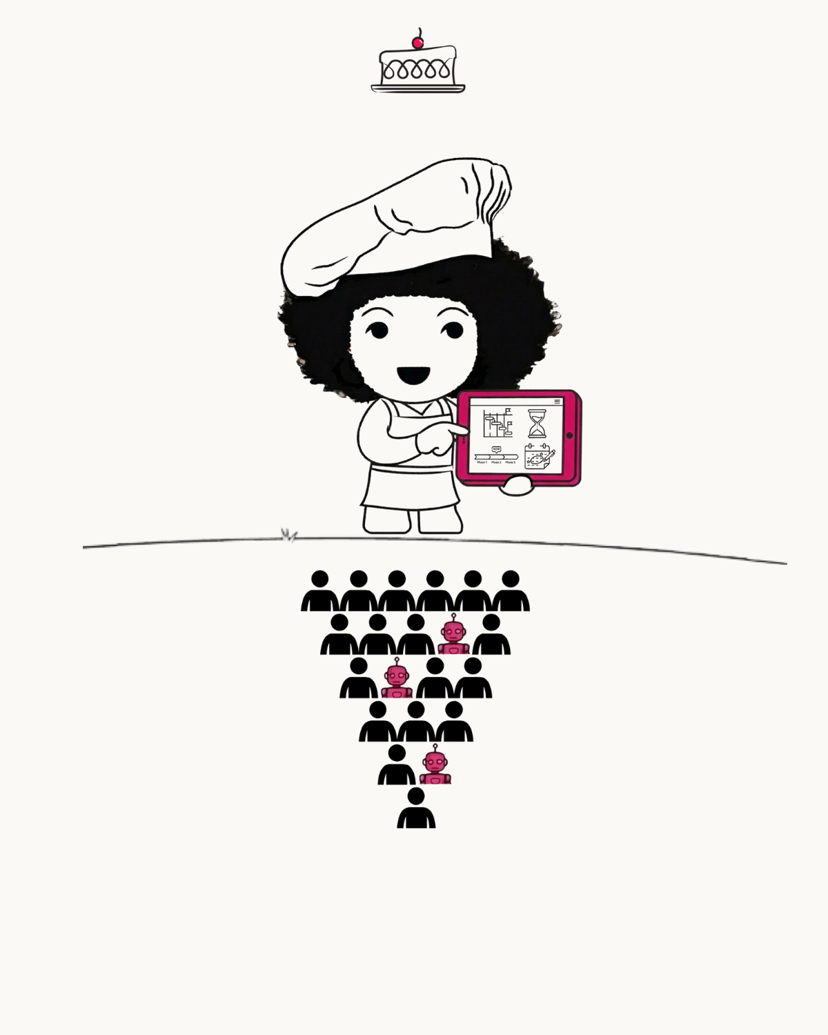
Everyone is talking about "context engineering" and "agentic workflows" when they could just say "giving better background info" and "letting AI do tasks for you".
If you are finding it hard to keep up, it’s no surprise when you hear AI industry experts say things like: “You could pause model development today and the consumer wouldn't notice for five years”.
More than half of professionals say learning AI feels like another job and a third admit to feeling embarrassed by how little they understand it.
For those people like me, who are just trying to do our best and work more efficiently, here are my 3 essential ingredients for working with any AI.
Swipe through to see how I keep it simple.
Big thanks to The Neuron - AI News for being my go-to guide in this new world!
(Sources: Quote from Caspar Eliot, VP of Solutions at Invisible Technologies; research stats from global research published by LinkedIn in August 2025).